
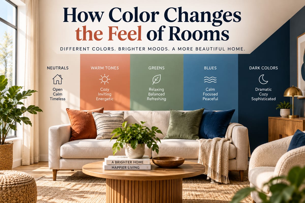
**How Color Changes the Feel of Rooms
Color can dramatically change the way a room looks and feels. A pale wall can make a small space appear more open, while a deep shade can create a sense of intimacy and warmth. Even subtle differences between colors can influence how furniture, lighting and architectural details are perceived.
Choosing colors for a home is therefore about more than picking favorite shades. Color can affect visual proportions, atmosphere, perceived temperature and the way different elements work together.
Understanding these effects can make it easier to create rooms that feel comfortable, practical and cohesive.
Why Color Has Such a Strong Effect
Color is one of the largest visual elements in an interior.
When someone enters a room, walls, ceilings, floors, furniture and accessories all contribute to the overall color impression. The relationship between these elements can influence whether the space feels bright, calm, dramatic, energetic or enclosed.
Color also interacts with natural and artificial light. The same paint can look noticeably different in a sunny room compared with a space that receives little daylight.
This means there is rarely a single “best” color for a room. The surrounding environment matters just as much as the color itself.
Light Colors Can Make Rooms Feel More Open
Light colors generally reflect more light than dark colors.
Whites, creams, pale grays, soft blues and other light shades can make walls appear less visually heavy. This can be particularly useful in smaller rooms or spaces with limited natural light.
A light-colored room may feel:
- More spacious
- Airier
- Brighter
- Cleaner
- Less visually crowded
Light colors do not physically increase the size of a room, but they can change its perceived proportions.
Using related light shades across walls, ceilings and larger furnishings can create an especially continuous appearance.
Dark Colors Can Create Depth and Intimacy
Dark colors absorb more light and tend to make surfaces feel visually closer.
This can make a room feel more intimate and enclosed rather than necessarily making it feel smaller in an undesirable way.
Deep navy, charcoal, forest green, burgundy and other rich shades can create a dramatic atmosphere when used thoughtfully.
Dark colors can work particularly well in:
- Bedrooms
- Reading rooms
- Dining areas
- Home offices
- Entertainment spaces
The effect depends on lighting, room size and the other colors present. A dark wall combined with generous lighting and lighter furnishings can create a balanced, sophisticated appearance.
Warm Colors Can Make Spaces Feel Inviting
Warm colors are generally associated with reds, oranges, yellows and many earthy tones.
They can create a sense of warmth and energy and may make a room feel more welcoming.
Soft terracotta, warm beige, muted yellow and earthy brown can work well in areas where people gather and socialize.
However, highly saturated warm colors can become visually intense when used across large surfaces. Softer or muted versions can provide warmth without overwhelming the space.
Cool Colors Can Create a Calmer Atmosphere
Cool colors commonly include blues, greens and many blue-based grays and purples.
These colors can create a feeling of calmness and visual freshness.
Soft blue may work well in a bedroom or bathroom, while muted green can bring a natural quality to living spaces and home offices.
Cool colors can also interact strongly with natural daylight. In a room with limited sunlight, some cool shades may appear particularly subdued or chilly.
Neutral Colors Provide Flexibility
Neutral colors include shades such as white, cream, beige, gray, taupe and many variations of brown.
They are popular because they can provide a flexible foundation for furniture, artwork and decorative accessories.
A neutral room does not have to be boring. Texture, contrast, natural materials and carefully chosen accent colors can add considerable visual interest.
For households developing a broader decorating scheme, the Complete Guide to Home Decor and Styling offers a wider look at how colors, furnishings and decorative elements can work together.
Saturation Changes the Mood of a Color
Two colors can belong to the same general family but create very different impressions because of their saturation.
A highly saturated blue may feel energetic and dramatic, while a muted blue can feel softer and more relaxed.
The same applies to greens, yellows, reds and other hues.
For large surfaces such as walls, lower-saturation colors can sometimes be easier to live with because they create less visual intensity. More vibrant shades can then be introduced through smaller elements such as cushions, artwork, rugs or accessories.
Bright Colors Can Become Focal Points
A strong color can draw attention to a particular part of a room.
For example, a brightly colored chair, painted cabinet or accent wall can become a visual focal point against a more restrained background.
This can be useful when a room lacks a clear feature.
Instead of covering every wall in a bold shade, homeowners can use a concentrated area of color to guide the eye.
The approach can also make it easier to change the room later because smaller decorative pieces are generally simpler to replace than large painted surfaces.
The Ceiling Can Change the Perceived Height
Color choices do not stop at the walls.
A lighter ceiling can make a room feel taller and more open, particularly when it contrasts gently with the walls.
A darker ceiling can create a more enclosed and intimate feeling. This can be effective in rooms where a cozy atmosphere is desirable.
Painting the ceiling a color similar to the walls can also reduce visual boundaries and create a more enveloping appearance.
The best choice depends on the room’s proportions, architectural details and desired atmosphere.
Color Can Influence How Furniture Looks
The same piece of furniture can appear different depending on its surroundings.
A dark sofa against a light wall creates strong contrast and can become a prominent feature. The same sofa against a dark wall may blend more closely into the background.
Similarly, natural wood furniture can look warmer against certain colors and cooler against others.
Furniture should therefore be considered alongside wall colors rather than selected independently.
For guidance on coordinating furniture with the wider home, Furniture Selection: Complete Guide to Choosing Home Furniture explores the factors that can influence furniture choices.
Color and Natural Light Work Together
Natural light can significantly alter the appearance of a color.
A room receiving strong morning sunlight may display colors differently from one receiving warm afternoon light. Rooms facing different directions can therefore produce different visual results even when the same paint is used.
Before committing to a large quantity of paint, it can be useful to observe samples at different times of day.
Cloudy conditions, direct sunlight and evening light can each change how a color appears.
Artificial Lighting Can Transform Colors
Artificial lighting also influences color perception.
Warm-toned bulbs can make certain colors appear warmer, while cooler lighting can emphasize blue or green undertones.
This is why a color that looks appealing in a store or online photograph may appear different once it is installed in a home.
Lighting should be considered as part of the color plan rather than treated as an unrelated decision.
The relationship between illumination and interior atmosphere is explored in How to Use Lighting Effectively Throughout a Home.
Small Rooms Do Not Always Need White Walls
A common assumption is that every small room should be painted white.
Light colors can certainly help a compact space feel brighter and more open, but they are not the only option.
A small room can also work with a darker or more saturated color when the goal is to create a cozy, dramatic or intimate environment.
The decision should consider the room’s function and available lighting rather than relying solely on its dimensions.
Large Rooms Can Benefit From Color Zoning
Large open spaces can sometimes feel visually disconnected when everything uses exactly the same color.
Different shades can help define functional areas without requiring physical walls.
For example, a living area might use a warm neutral while a nearby dining area incorporates a slightly deeper version of the same color family.
Color can therefore contribute to spatial organization.
This is particularly useful in open-plan homes where furniture and architectural features must work together to establish distinct zones.
Monochromatic Color Schemes Create Continuity
A monochromatic scheme uses different shades, tones or tints of a single basic color.
For example, a room might combine pale blue walls with medium-blue upholstery and deeper blue accessories.
This creates visual consistency while still allowing variation.
Texture becomes particularly important in monochromatic rooms. Wood, fabric, metal, glass and natural fibers can prevent the space from feeling flat even when the color palette is relatively narrow.
Complementary Colors Create Contrast
Complementary colors sit opposite one another on a traditional color wheel.
Using contrasting color families can create visual energy.
However, complementary colors do not need to be used in equal amounts. A dominant neutral or primary shade can be paired with a smaller amount of its contrasting color through artwork, cushions, furniture or accessories.
This approach can create interest without making the entire room visually intense.
Analogous Colors Can Feel Harmonious
Analogous colors sit next to each other on the color wheel.
A combination of blue, blue-green and green, for example, can create a naturally connected palette.
These combinations can feel cohesive because the colors share visual characteristics.
Analogous palettes are particularly useful for homeowners who want more color than a neutral scheme provides without creating strong contrasts.
Color Can Connect Different Rooms
A home does not need to use exactly the same color everywhere to feel cohesive.
Instead, colors can be repeated or related across different spaces.
A green used in a living room might appear again in artwork in a hallway. A warm neutral from the kitchen could be repeated in a nearby dining area.
Repeating small elements creates connections between rooms without making every space identical.
This is one aspect of broader interior planning, which is discussed in The Interior Design Explained.
Hallways and Transitional Spaces Matter
Hallways are sometimes overlooked when developing a home’s color scheme.
Because they connect rooms, their colors can influence how one space transitions into another.
A neutral hallway can provide a visual pause between rooms with stronger color schemes. Alternatively, a carefully chosen accent shade can create continuity between otherwise different spaces.
Even small transitional areas can therefore contribute to the overall visual experience of a home.
Color and Texture Should Be Considered Together
Color does not exist independently from surface texture.
A matte painted wall reflects light differently from glossy tile. Natural wood, woven fabric, stone and metal each interact with color in their own ways.
A single shade can consequently appear different depending on the material carrying it.
Adding texture can also make a simple color palette more interesting without requiring additional colors.
Using Accent Colors Without Overwhelming a Room
Accent colors are most effective when they have a clear role.
A homeowner might choose one dominant neutral, one supporting color and a smaller accent shade.
The accent could appear in:
- Artwork
- Cushions
- Curtains
- Rugs
- Decorative objects
- Small furniture pieces
- Plants and natural elements
Repeating the accent in several locations can make it feel intentional rather than random.
Testing Paint Before Making a Final Decision
Paint samples can prevent expensive mistakes.
A color should ideally be viewed on the actual wall because surrounding surfaces and lighting can influence perception.
It can help to observe a sample during different parts of the day and under the room’s usual artificial lighting.
Large sample areas are often more informative than tiny color cards because the surrounding wall color can affect how a shade is perceived.
Color Preferences Can Change Over Time
A home does not need to reflect a permanent design decision.
Personal tastes evolve, furniture changes and household needs shift.
Someone who prefers neutral interiors today may want more color later. A child’s room may need to adapt as they grow. A home office may eventually become a guest room or another living space.
Flexible color schemes can make these transitions easier.
There Is No Universal Perfect Color
The effect of color depends on many factors, including room size, natural light, artificial lighting, furniture, materials and personal preference.
A shade that creates a relaxing atmosphere for one household may feel too cool or subdued to another.
Rather than following rigid rules, homeowners can use color intentionally based on how they want a particular room to function and feel.
Creating Rooms That Feel Right
Color is one of the simplest ways to transform the character of a room without changing its basic structure.
Light colors can increase the perception of openness, dark shades can add depth, warm hues can create an inviting atmosphere and cool colors can introduce a sense of calm. Neutral palettes can provide flexibility, while carefully chosen accent colors can give a space personality.
The most successful color choices usually come from considering the entire room rather than a wall in isolation. Lighting, furniture, flooring, textures and adjacent rooms all influence the final result.
By understanding these relationships, homeowners can use color not simply to decorate a room, but to shape how the space is experienced every day.





2 Comments
Micle harison
June 7, 2019Lorem ipsum dolor sit amet, usu ut perfecto postulant deterruisset, libris causae volutpat at est, ius id modus laoreet urbanitas. Mel ei delenit dolores.
John Doe
June 7, 2019Some consultants are employed indirectly by the client via a consultancy staffing company.